"I want my site to look professional. Where do I start?" Many site owners ask this question on the WP-Script Discord. My answer: on a tube site, a professional design is the thumbnail grid, not the decoration. A custom design pays for decoration. A theme made for tube sites pays for what visitors actually look at. And one more rule: every ad you add costs you visitors. You need ads to earn money, so choose where they go. Do not fill every free space.
WP-Script is made by PandaCorp, a company that has existed since 2016. Our themes run on hundreds of tube sites, and the same design mistakes come back again and again. Here are the 7 things I tell them to get right.
TL;DR
- One thumbnail format for the whole site. 16/9 for a classic tube site.
- Sharp but light thumbnails. They fill their frame and load fast.
- A preview on hover. Thumbnail rotation or a trailer.
- Titles and durations people can read on a phone.
- The right number of videos per page, and a home page that can be browsed.
- Built for the phone, and fast. Two videos per row, nothing over the player.
- A few ad spots, tested. Each extra ad costs visitors.
Get these 7 right and your site looks professional. You do not need a custom design for that: a theme made for tube sites already does it. In this guide I use RetroTube as the example.
What visitors look at on a tube site
A visitor arrives from Google or from another site. They land on a video page or on a list of videos. Very fast, they decide to watch or to leave. What they look at:
- The thumbnails. Is there something they want to watch?
- The title and the duration under each thumbnail.
- The player, on a video page. Does it start fast? Is something covering it?
Nobody stays on a tube site because of a nice header, a special font or an animation. They stay because the next video they want is right there. This is why the 7 things below are about the grid, the previews, the phone and the ads.
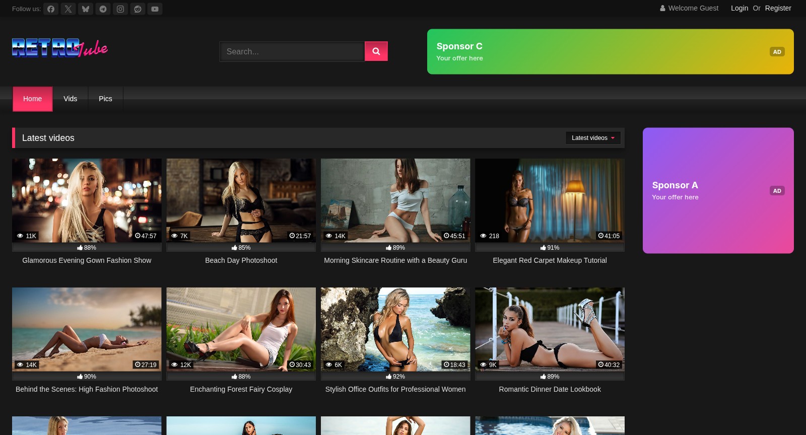 A RetroTube list page on a computer: one 16/9 thumbnail format, with titles, durations and views under each video
1. One thumbnail format for the whole site
Mixed formats make a grid look broken: a square image next to a wide one, a stretched face, black bars. It is the first thing that makes a site look amateur. Choose one format and keep it everywhere.
RetroTube offers 5 formats in the Theme Options, under "Aspect ratios of thumbnails": "16:9" and "4:3" (landscape), "9:16" and "DVD / Blu-ray" (portrait) and "Square". For a classic tube site, choose 16:9: it is the shape of most videos and of the player, so the list pages and the video pages look the same. Choose a portrait format only for a vertical site, with short videos filmed on a phone.
2. Sharp but light thumbnails
Next to the format, set how each image fits its frame ("Object fit of thumbnails"). Keep Cover: the image fills the frame and the edges are cut. It is the RetroTube default, and it never shows black bars.
Then the quality. A blurry thumbnail looks cheap. A heavy one makes the page slow on a phone. RetroTube has 3 quality levels: Basic, Normal and Fine. Normal is the default, and it is the right choice for most sites.
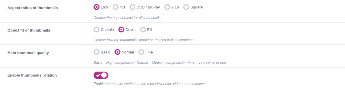 RetroTube Theme Options: aspect ratio 16:9, object fit Cover, main thumbnail quality Normal, thumbnail rotation on
Thumbnails must also have the right size from the first second. A member of our Discord reported thumbnails that looked stretched for a second while the page loaded. That was a bug in UltimaTube and KingTube, fixed on November 10, 2026. If you see it on your site, update your theme.
3. A preview on hover
A still image says little. A preview says a lot. RetroTube shows it in two ways:
- Thumbnail rotation: when the mouse is over a thumbnail, it shows other images of the video. It is on by default.
- Trailers: a short clip plays when the mouse is over the thumbnail, or when a finger touches it on a phone, if the video has one. WPS Mass Embedder downloads the trailer when you import a video, if the source gives one and the Video trailer option is on. When a video has a trailer, RetroTube shows the trailer instead of the thumbnail rotation.
Keep at least one of the two. It is the closest thing to a "watch this" button.
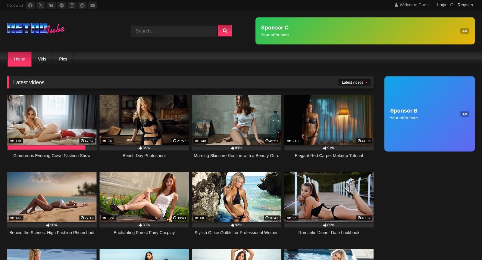 Thumbnail rotation in RetroTube: the thumbnail under the mouse shows other images of the video, the others stay still
4. Titles and durations people can read
The title under a thumbnail must be readable on a phone, in one or two lines. Short titles that describe the video work better than long lists of keywords. Show the duration on the thumbnail: many visitors choose a video by its length.
5. The right number of videos per page
RetroTube shows 28 videos per page on a computer and 20 on a phone by default. These numbers are fine. More videos means a heavier page. Fewer videos means more clicks to find something.
One trap I see often: on the home page, many owners add widget blocks, such as "Latest videos", "Most viewed" or "Random". It looks rich. But in RetroTube, when the home page has widgets, they replace the paginated list of videos, so the home page has no page 2. Two Discord members asked why their home page had no pagination: this was the reason. Use widgets for a magazine home page. Remove them if you want visitors to browse your whole catalogue from the home page.
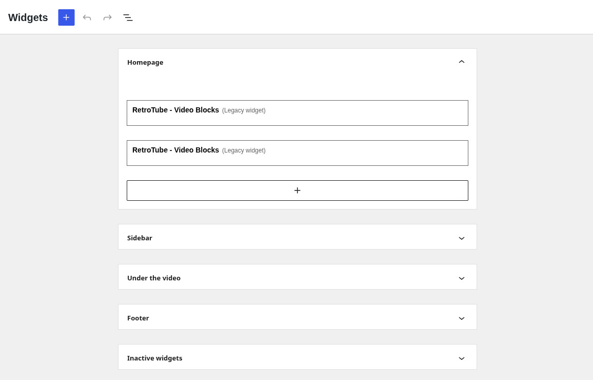 The Homepage widget area in Appearance, Widgets: widgets placed here replace the paginated list of videos
6. Built for the phone, and fast
Many visitors watch on a phone. Check your site on a real phone before you check it on your computer:
- Two videos per row. It is the RetroTube default on mobile, and it keeps thumbnails large enough to see.
- Nothing covers the player. No sticky banner over the video, no pop-up when the page opens.
- The page opens fast on a slow connection. Big images, extra fonts and scripts are the usual cause when it does not.
- The menu is short. On a phone, nobody scrolls a menu of 40 categories. Keep the main niches, and put the rest on a categories page.
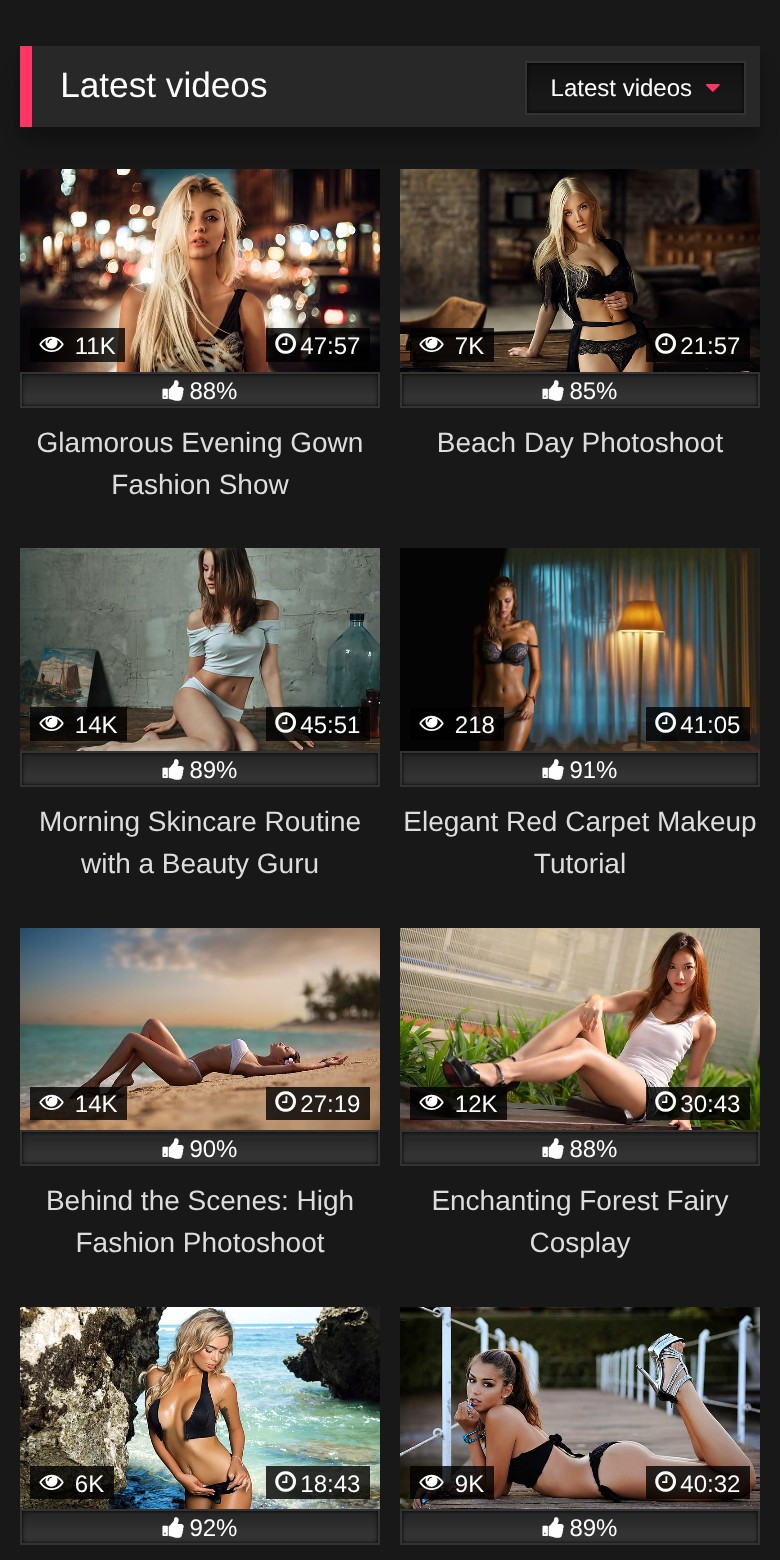 RetroTube on a phone: two videos per row
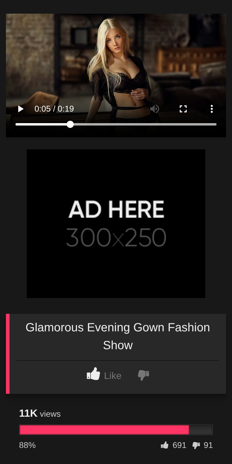 A RetroTube video page on a phone: the player is visible and nothing covers it
Speed matters on large sites too. On sites with tens of thousands of videos, Discord members saw their server overloaded by the related videos block under each video. RetroTube 1.16.7 fixed it: the block no longer sorts the whole database at random on each page view.
7. A few ad spots, tested
Most tube site owners think in spots: "this space is empty, I can put a banner there." Each new banner earns a little. But each one also makes the page slower, pushes the videos down, and makes some visitors leave. After a certain point, you lose more visitors than the extra banner earns.
This is not only my opinion. The Coalition for Better Ads publishes the ad formats that people hate the most, and Chrome follows its list: on a site that keeps breaking these rules, Chrome can block all the ads. On a phone, the list includes pop-up ads, ads before the content (prestitials) or with a countdown after it, large sticky ads, and pages where ads take more than 30% of the height. If your site lives from ads, you do not want to be on that list.
The limit: you earn money with ads, so the answer is not "no ads". The answer is "the right spots, tested". Here is how I would set them:
- Start with the spots visitors see without being blocked. In RetroTube: the header zone, the zone under the video player, the sidebar on a computer, and the footer. Each one has its own mobile version, because a desktop banner can break a phone page.
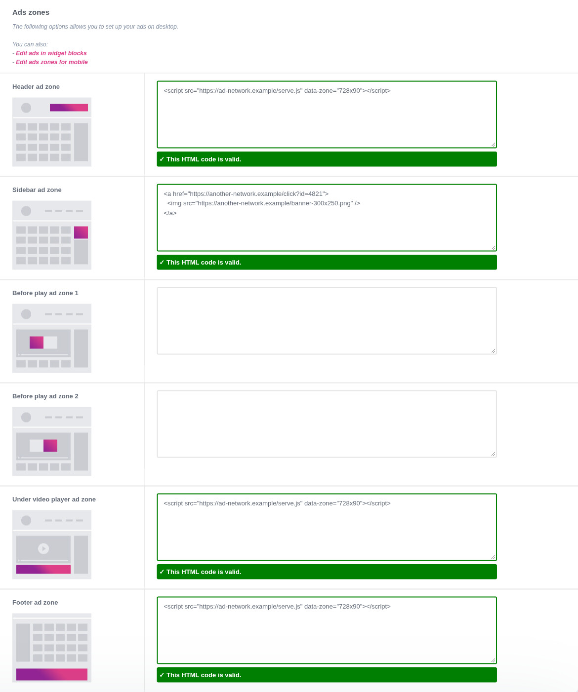 RetroTube ad zones on a computer: header, sidebar, 2 before-play zones, under the video player and footer
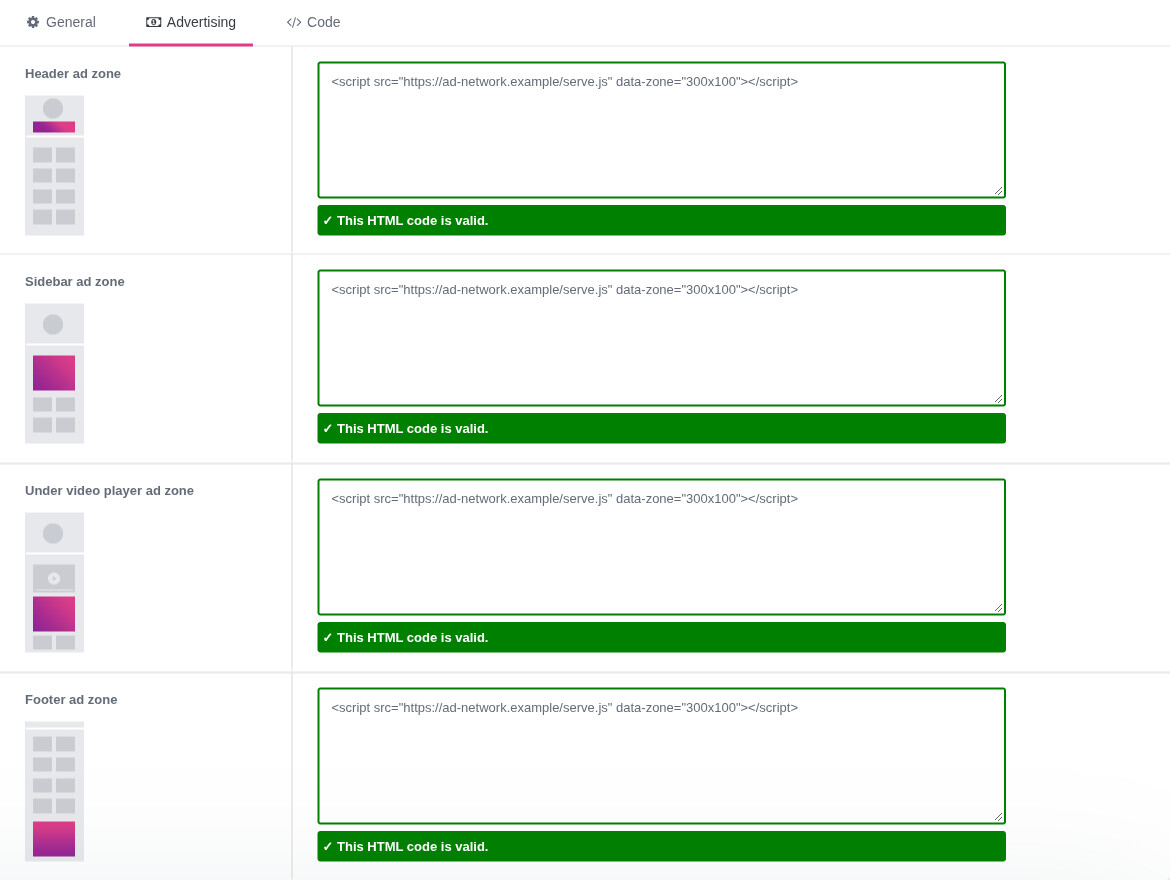 RetroTube ad zones on a phone: header, sidebar, under the video player and footer
- Be careful with ads before the video plays. RetroTube has 2 zones for that. They can earn well, but a visitor who waits too long goes back to Google. Test them, do not keep them out of habit.
- Pop-unders go in Other scripts (computer) and Mobile scripts (phone). One pop-under per visit is already a lot. If you add one, compare your pages per visit before and after.
- Measure, then remove. A banner that nobody clicks costs you speed and visitors for nothing. WPS Ad Manager shows the CTR (the share of visitors who click) of each banner, and lets two banners compete for the same spot. I explain the method in How to Add Ads to a WordPress Video Site.
Custom design or tube theme: where your money goes
You will pay for your design, one way or another. The question is what you pay for.
A designer makes a custom header, a special font, a custom menu, maybe animations. That is decoration. The 7 things above, the ones that make visitors watch, still have to be built, tested on phones and kept working. A theme made for tube sites comes with all 7 already built, and with the settings to make it yours.
A custom design also has costs that come later:
- Every change must survive updates. When a theme gets an update, every change made in its files is erased. Changes must live in a child theme, and someone must check them after each update.
- Custom work adds weight. Extra fonts, scripts and large images cost seconds on a phone.
- You pay again for every change. New menu, new page, new section: back to the designer.
| Tube theme | Custom design | |
|---|---|---|
| Thumbnail grid, previews, player | Built and tested | To build |
| Phone version | Built, with its own settings | To build and test |
| Ad zones, desktop and mobile | Built | To build |
| Your logo, color and background | In the Theme Options | Made by the designer |
| Updates | Included for life, with a one-time payment | Paid each time |
| Ready | The day you install it | When the project ends |
The limit: if you sell your own content on a paysite, or if you build a brand that people come back to by name, the look is part of what they pay for. There, a custom design can pay back. For a tube site that lives from search traffic and ads, a tube theme is the better buy.
What to do now
- Open your site on your phone, on a list page and on a video page. Look at the thumbnails first, then look for anything that covers the player.
- Go through the 7 points above, one by one. Most of them are a setting in your Theme Options.
- List your ad spots. For each one, ask: does it earn enough to pay for the visitors it costs? Remove the ones you cannot answer for.
- If your current theme cannot do one of the 7 points, compare the WP-Script themes and try their demos.
If you are starting a site from zero, my complete guide is How to Start a Porn Site.
FAQ
Do I need a designer to make a professional porn site?
Not for a tube site. A theme made for tube sites, like RetroTube, comes with the grid, the player, the previews, the phone version and the ad zones. Your logo, your main color and your background make it yours. A designer makes sense for a paysite or a brand.
Which thumbnail format should I choose?
16/9 for a classic tube site, because it is the shape of most videos and of the player. A portrait format (9/16) only for a vertical site with phone videos. Use the same format on the whole site.
How many ads can I put on a page?
There is no magic number. Check two things: on a phone, ads should not take more than 30% of the page height (Better Ads Standards), and nothing should cover the player. Then measure each banner and remove the ones nobody clicks.
Why does my home page have no page 2?
In RetroTube, when you add widgets to the home page, they replace the paginated list of videos. Remove the home page widgets to get the paginated list back.
Can I change the look of the theme without touching the code?
Yes. In RetroTube: logo, main color, background, layout (boxed or full width), thumbnail format and quality, all in the Theme Options. For anything more, use a child theme so your changes survive updates.